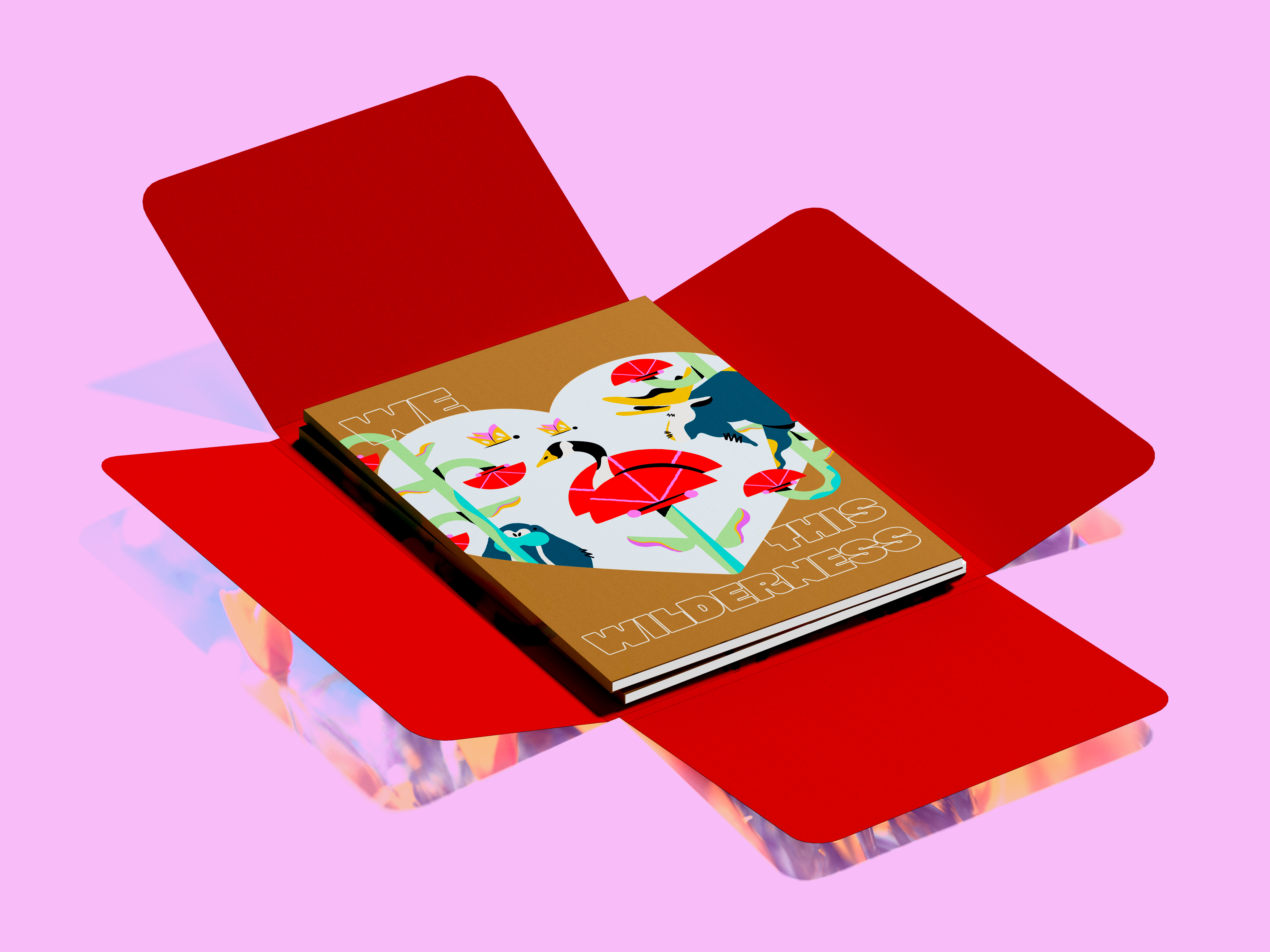
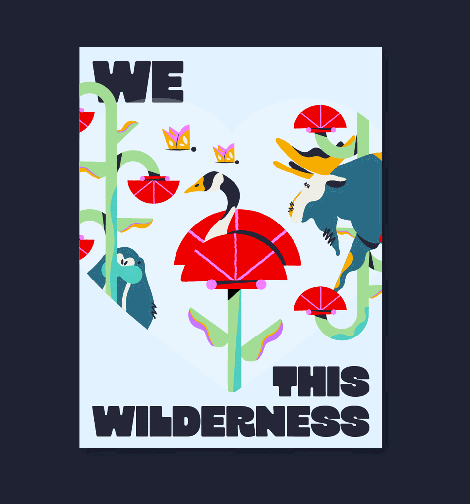
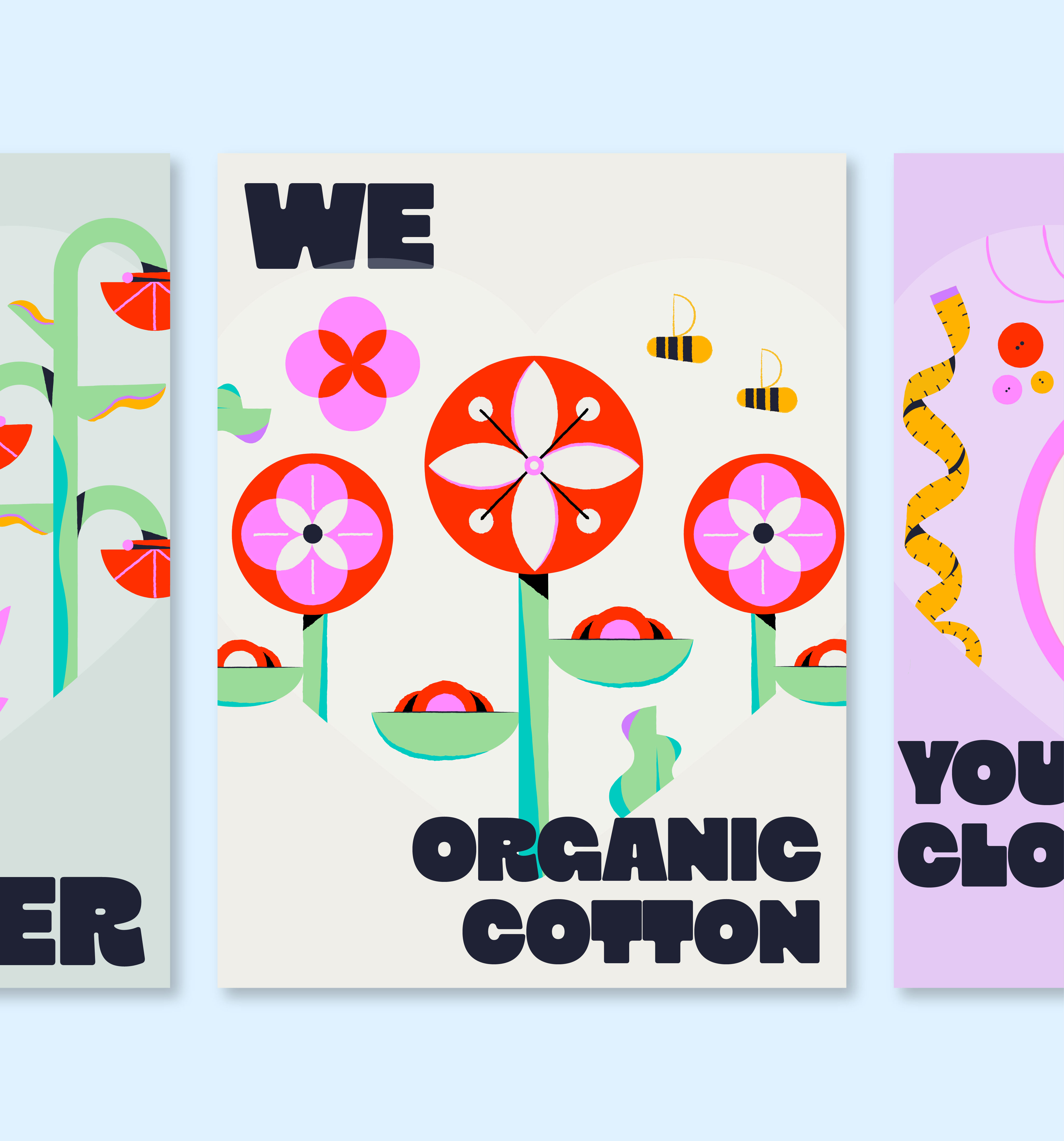
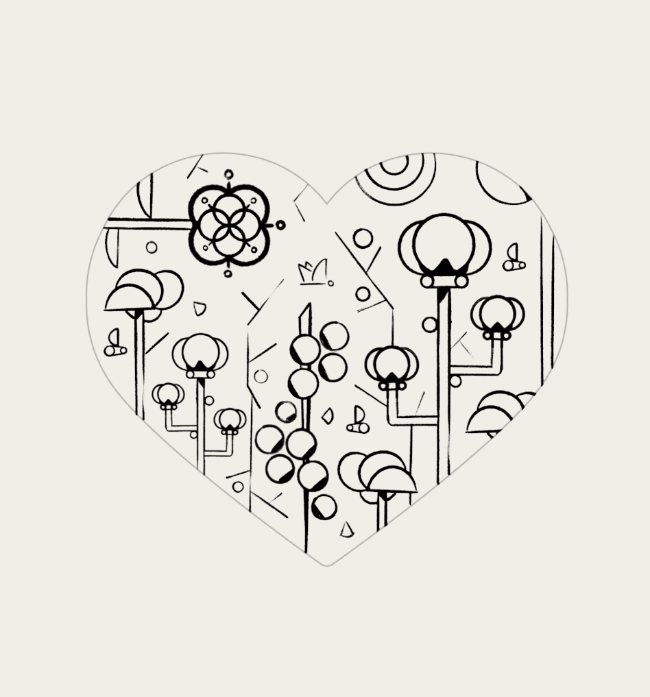
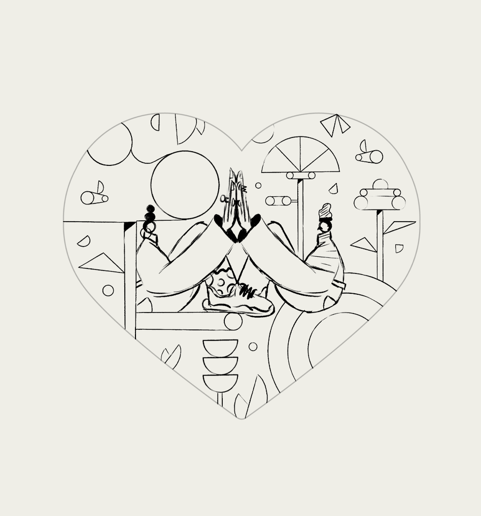
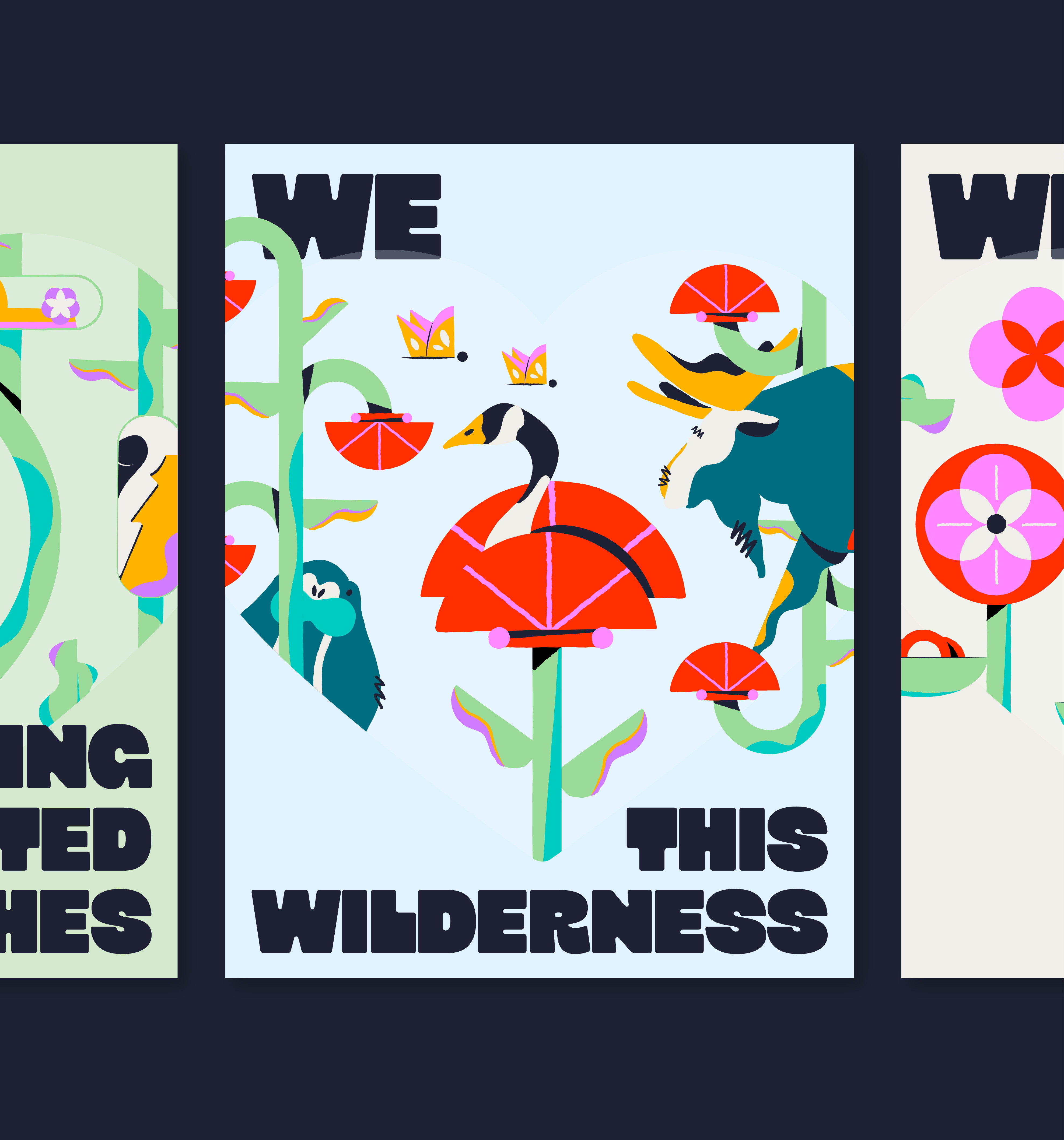
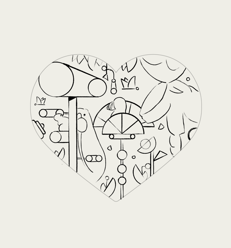
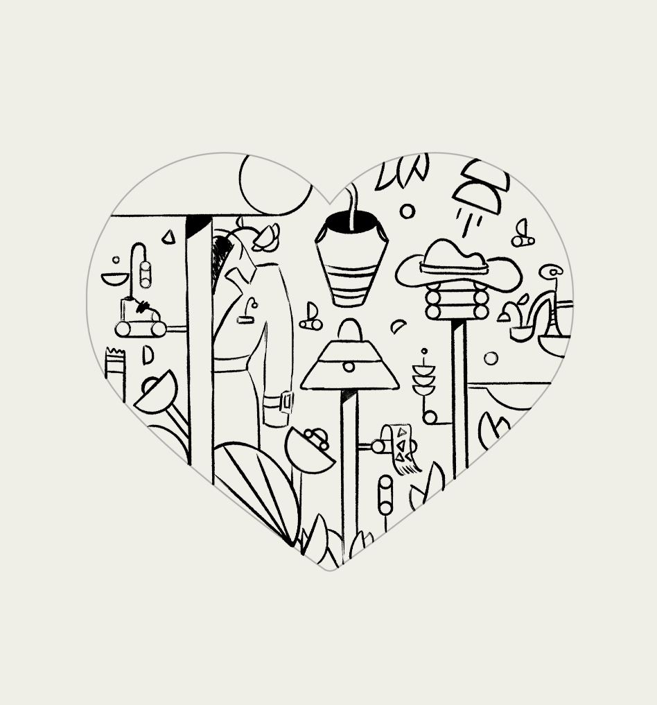
We developed five distinct illustrations—one for each pillar—using a consistent visual style. Same artistic approach, but each heart told its own story. Wilderness: Celebrating their partnership with a major animal welfare NGO. The design featured native Canadian wildlife—moose, Canadian geese, Monarch butterflies—showing the ecosystems they were helping protect. Organic cotton: Highlighting their commitment to using organic cotton in most garments. The design featured the cotton plant rendered in a more abstract, graphic way. Recycling unwanted clothes: Promoting their circular recycling program. The illustration showed a piece of clothing transforming into something new—like a garment becoming a bag. Visually showing the journey from discarded to reborn. Love your clothes longer: Supporting their repair and garment care initiative. The design featured clothing being mended, with sewing motifs throughout. Love one another: Representing a partnership with a social mission organization. The illustration showed two hands and a heart, emphasizing human connection and community.
Here's the thing about sustainability campaigns for major brands: they walk a very fine line. Too earnest and you look like you're greenwashing. Too playful and people don't take your commitment seriously. Too corporate and nobody connects emotionally. The heart concept helped—it's universal, emotional, immediate. But the illustrations inside each heart had to do a lot of work: represent the pillar clearly, feel cohesive as a system, work across different contexts (in-store signage, digital, print), scales, and most importantly, not look like generic eco-messaging that every brand uses. Also, it had to work in North America first, with the possibility of expansion. Which meant the visual language needed to be specific enough to be interesting but universal enough to translate across cultures.