
Working on something that matters —
I'd love to hear about it and explore how we can work together.
I'd love to hear about it and explore how we can work together.
Let's talk

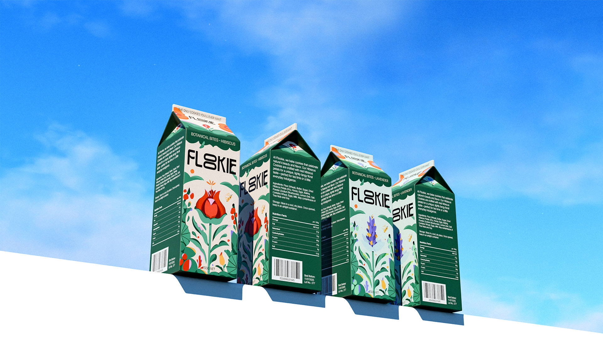
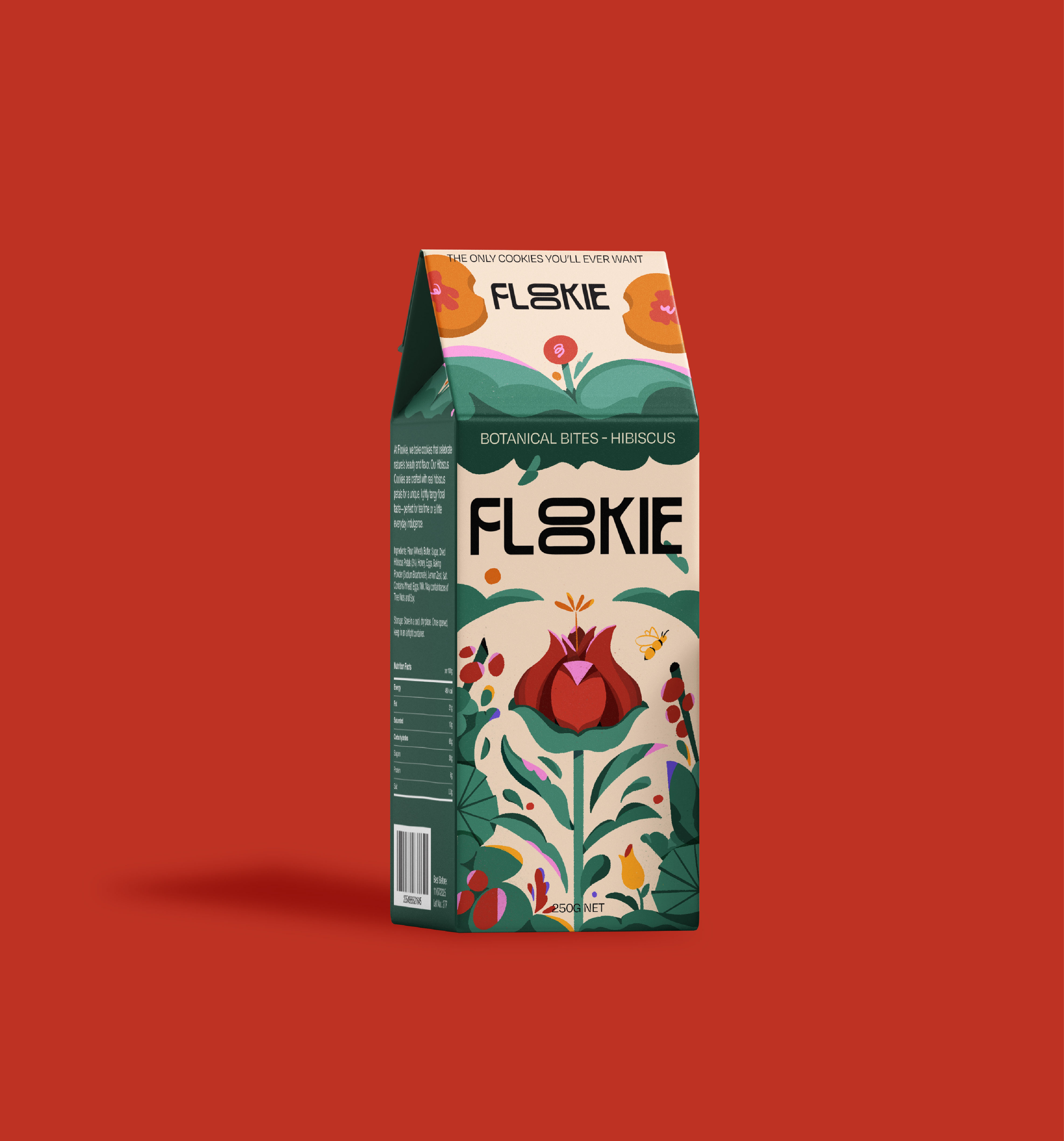
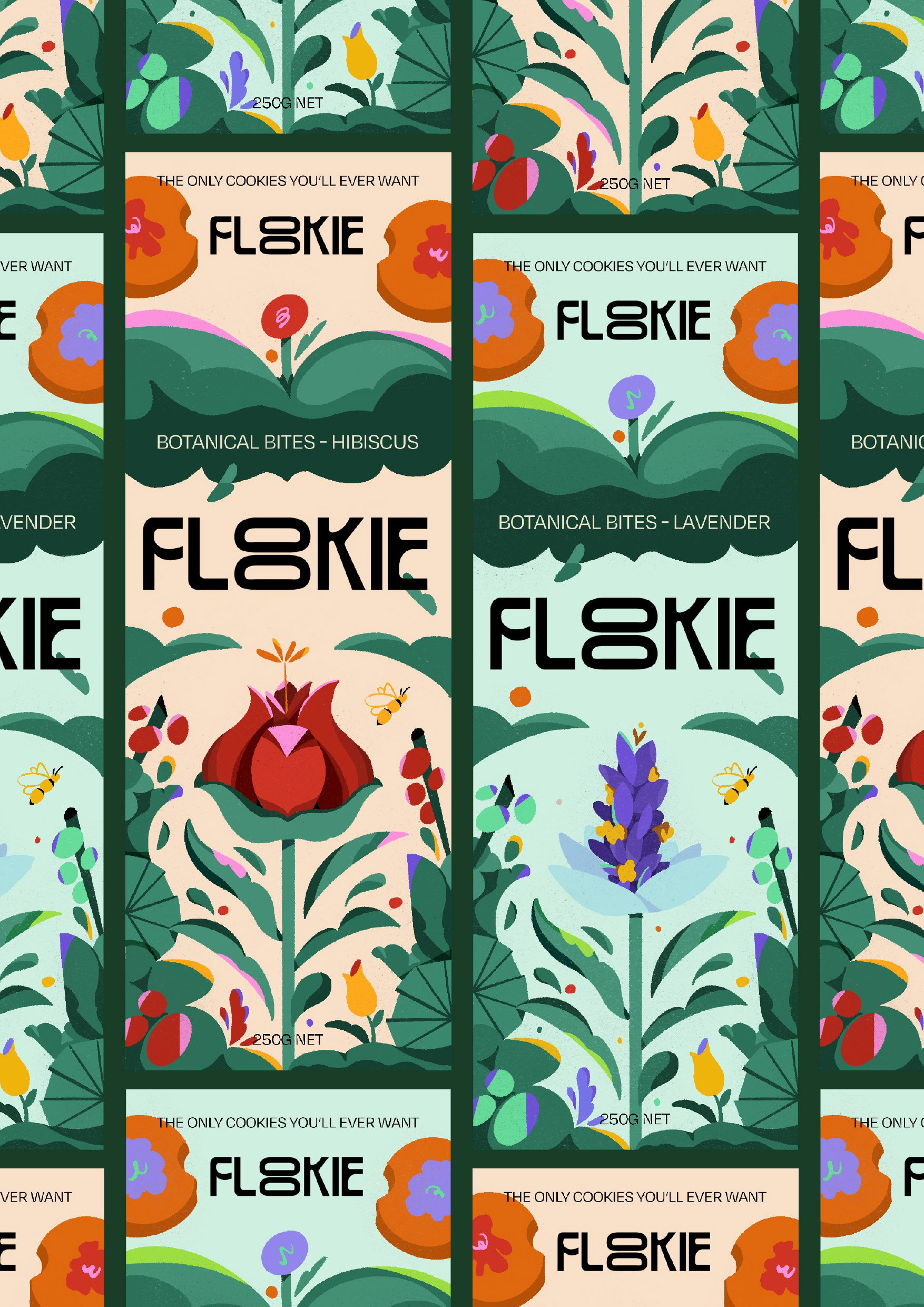
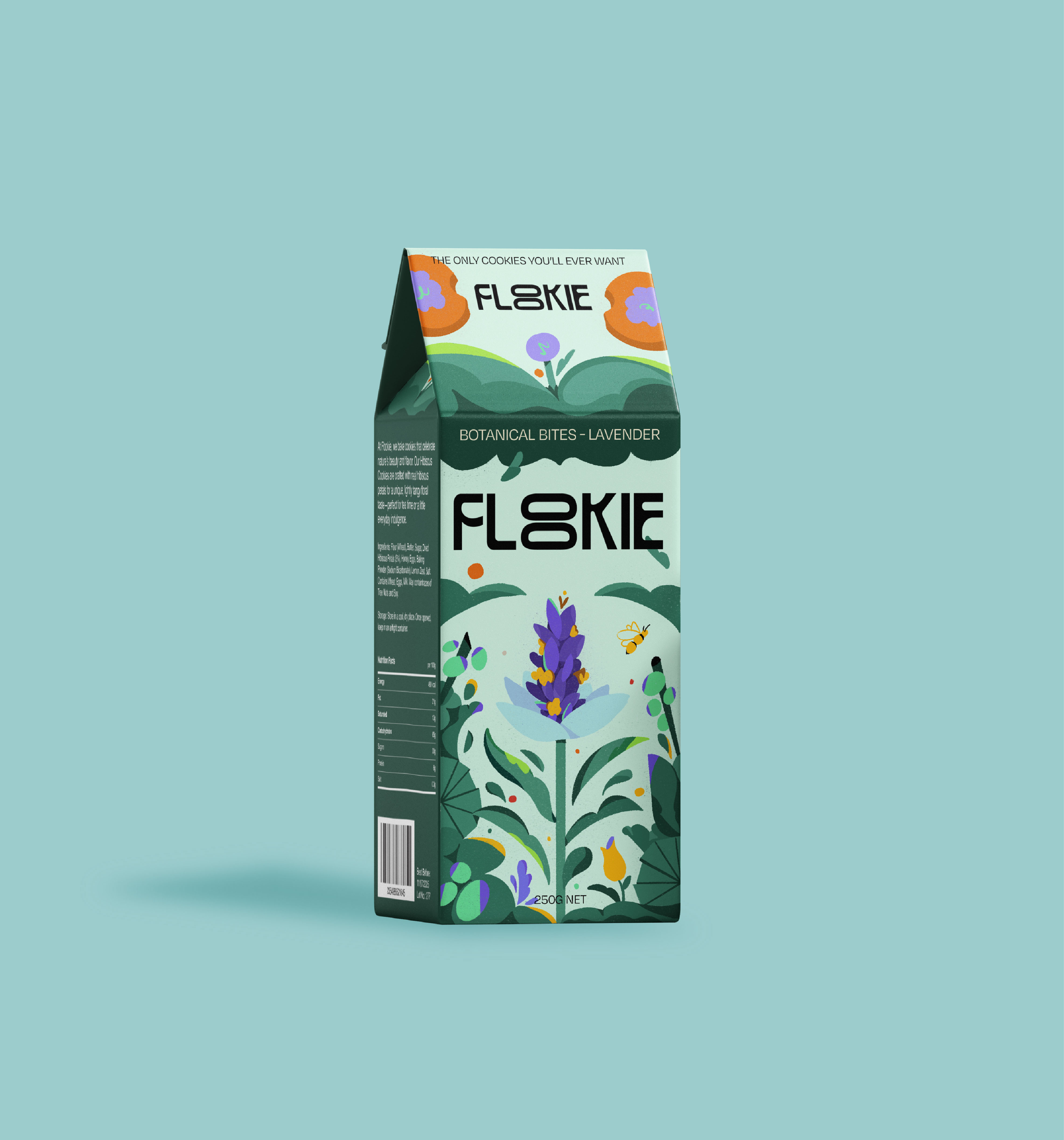
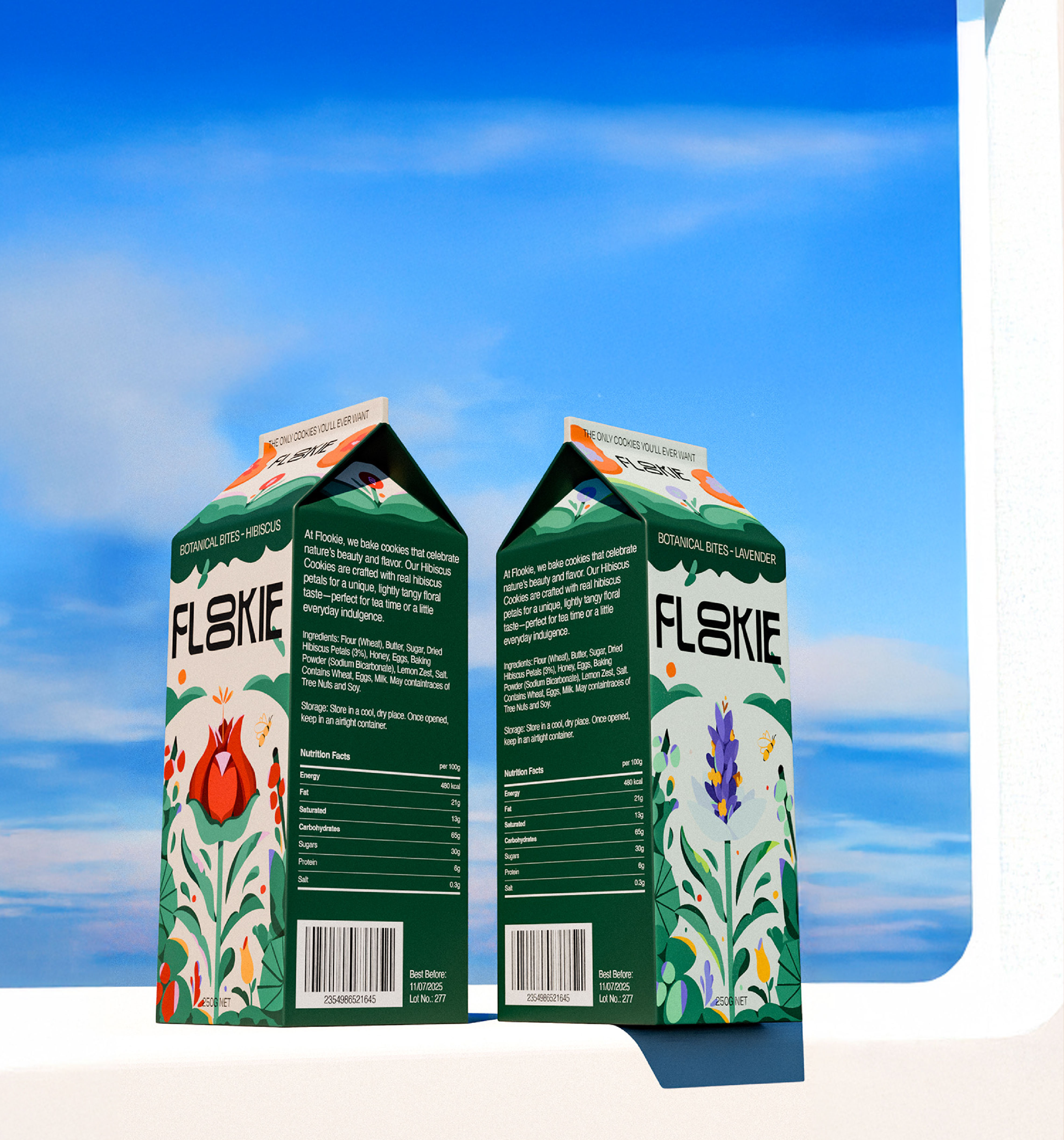
Hibiscus: bold, vibrant, tropical. Lavender: delicate, calming, refined. Different personalities, same visual system—they needed to work as a pair while standing alone. The course was focused on illustration for commercial contexts, which means different priorities than personal work: readability at small scale, printing considerations, balancing beauty with function. Good practice for the kind of client work where illustration has to sell something, not just look good.